Arthur Rackham

I have chosen to look at the play Ashputtel by Carol Ann Duffy (adapted form the Grimm tales). I am focusing on scene eight, the third and final feast, where Ashputtel loses her slipper.


I started my research with Rackham (1829-1939) as he did illustrations for the Grimm tales. My production designs would fall into the fantasy genre. The theme I explored was fairgrounds. The idea for the stage was for it to be bright with lots of lights, and for the back drop to be in black and white. This idea came from 'The Wizard of Oz', where the two tone
world represents normal boring everyday life and the colourful world represents something exciting.


Thursday, 2 December 2010

Sketch Model Continued


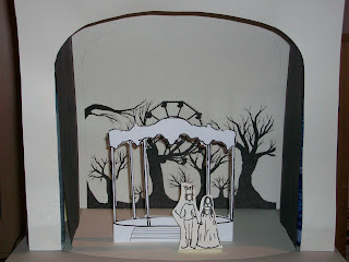
These images are my 1:25 sketch model with 1:25 scale people, roughly 5ft 5'' and 5ft 11''. They contain a kind of band stand where Ashputtel and the Prince dance, some have the helter skelter in. I think the helter skelter would have to be a flat. I have removed the two front stalls from my original sketch, as there isn't a lot of room.


I think this design looked good on paper, but it doesn't work well on the model. I think the weakest aspect is the backdrop, as most of it is hidden, and there is a huge gap at the top. Also I dont like the trees, they don't look very strong, so I am going to refer back to Arthur Rackham's work to improve the backdrop.

Sketch Model


This is the backdrop roughly to scale, from two different angles.

Saturday, 27 November 2010

Developing the Stage


The front booths/stalls at the front of the stage don't serve a purpose at the moment, unlike the ferris wheel and helter skelter which set the fairground theme.If they're going to take up that much room, they should serve a greater purpose. I plan on making one of these booths/stands a platform for Ashputtel and the Prince to dance on. I'm also adding a stair case up to the platform so Ashputtel can run down it, and leave her slipper on the stairs.


I spoke about this idea with Andy, he suggested that further to this, it would be effective if this dance area could be wheeled into the centre stage, and everything esle wheeled out when the Prince and Ashputtel dance.


The is a basic design of what I want the dance area to look like. I need to research more images before I can put motifs on it.
The top image is the banner I used. David Braithwaite's book on fairground architecture was very helpful.

Ferris Wheel


This is a more detailed ferris wheel. I think it would work better in the backdrop as it won't be functional and it could be difficult to move on and off stage. I thought it would be best to paint the lights on, however when I asked Viv about this, she said that things like this are normally lit from behind and to use sheeting rather than canvas.

Helter Skelter Tree


I used Aldridge's idea of wrapping a helter skelter around an organic shape, I used a tree instead of a woman to fit in with my theme. I like my design, I think it would look effective. However I think this is too elaborate for a small stage-I think it would work better for a film. I plan on designing something more simple.

Helter Skelter


I want to make the everything more detailed. So I have been looking at more fairground images. I like this image by Alan Aldridge taken from The Beatles Illustrated lyrics (1969). It's a good example of putting a helter skelter into a fantasy genre. I like how Aldridge has wrapped the helter skelter around an organic shape.


I did a quick sketch of this in black and white to see how something like this would work in my stage design.

Initial ideas for the Backdrop


The first drawing didn't feel right. The helter skelter and the ferris wheel looked disconnected. Also there wasn't a strong sense of where the scene was being set. I added the trees to make everything more connected, and trees feature heavily in Grimm tales and Arthur Rackham's work. I think the trees have connected everything, set the scene (outdoors) and they create a creepy atmosphere.


My initial idea was to have the brightly coloured carousel infront of this black and white backdrop. When I took this idea too Andy he said it was too fussy and he suggested the backdrop should be the stage.


I am now developing this idea.

Fairground Research


These pictures, taken from Fairground Architecture by David Braithwaite were the images I used to create my initial backdrop. I like the use of black and white, it creates the feeling of an old movie, also it can help to create a creepy atmosphere.

Carousel


Initially I wanted quite an elaborate stage with a carousel. I imagined it to be brightly coloured, mainly red. However after a tutorial I realised this was too fussy, and didn't fit the scene. In addition to this, the stage isn't very big.


I used a photo from Carousel Horses by Sherrell S. Anderson. This book has lots of detailed photos. Then I produced a drawing from the photo. When I drew this I wasn't thing about colour. I think the carousel would be more effective in bright colours, mainly red and set against a dark background.

Fantasy Genre

I am focusing on the fantasy genre. For the scene I am looking at, the theme will be fairground. I like this theme because whilst it is real, it is also like a different world.

French and German Costumes 1650-1700


I used the book Costume Worldwide again to research this period. I like the clothes, and the silhouette of the women. I think the costumes have too many colours and patterns, and they would look better if they could be refined to something more simple.

Play analysis


This is my analysis of the play, broken down to the scene, plot, page and line, location, time and season, lighting, mood, props, costume, sound and cast.


I am focusing on scene eight. Since doing this table I have decided that scene eight should be split up further, so it runs from page 40, line 22- page 41, line 10. Then scene nine would be the sisters trying on the shoe page 41, line 11- page 43, line 17. Then there would be an additional scene (scene 10) page 43, line 18-page 44, line 7- this would be the wedding.

14th Century Germany


These are a research pages taken from my sketch book. I was looking at 14th century German costumes. I used the book Costume Worldwide A Historical Sourcebook Featuring the Classic artworks of Friedrich Hottenroth and Auguste Racinet. I found this book very helpful.


Although Rackham was influenced by the 13th Century, I found the pictures in the book taken from the 14th Century reminded me more of his work.


I don't like the clothing of this period, there isn't a lot of structure or shape to the women's clothes.


I think the men's clothing is slightly more interesting, but I'm not really inspired by it. Also I don't like the colours they are too bold.


Wednesday, 24 November 2010

Initial Reaction after Reading the Play


This is a page taken from my sketch book, with my version of one of Rackham's drawings.

Monday, 15 November 2010

Costume


These are drawings I did taken from Rackham's work. The females in his work often have long wavy hair. Rackham was influenced by 13th Century Germany, France of Louis XIV and Victorian England. I have researched the clothes of these periods .I'm going to research the fantasy genre next.

Scenery


These drawings I did are taken from Rackham's work. His drawings are often set in a castle or forest, and the interiors are mainly wood.